Movie Review: Wolverine

Not enough naked Hugh Jackman, in my opinion. Not enough Gambit. And I squeed a little when Patrick Stewart came on screen.

Not enough naked Hugh Jackman, in my opinion. Not enough Gambit. And I squeed a little when Patrick Stewart came on screen.

Yeah, it was… all right. Not bad, but not that good either. Just sort of… there. Which I expected, I’d read a couple of reviews and few of them were glowing. Okay special effects, and Hugh Jackman is welcome on my big screen anytime, but it just couldn’t gel into something coherent. Screaming, fighting, is Logan more animal than man?

I don’t know enough about Wolverine canon to say how faithful the story is, but from what I understand it’s been retconned to hell and back for years, so who knows? And maybe because there’s so damn much of it—150 years, give or take, which is apparently canon—they had to just hit the highlights. I was expecting that too, but it still bugged as much as Spiderman 3.

They did tie it in to the wider X-Men universe, though, with Scott Summers, Blob and Professor Xavier (again, squee), which I liked. But you know what I would have liked a lot more? If the couple who took Wolverine/Logan/Jimmy in after he escaped from Stryker’s facility had been James and Heather Hudson. Wolverine was a founding member of Alpha Flight after all, and he’s the one whose backstory kicked off the series, when he was only Canadian and not 150 years old, so was a cameo too much to ask for? Anything? Kayla’s sister with “diamond-hard” skin didn’t even turn out to be Diamond Lil. Hmph.

A few things that bugged: no blood on claws or Deadpool’s swords. Did the special FX people just not think about it, or was it a deliberate choice, to show off Wolvie’s shiny new claws or not traumatise the kiddies too much? Yeah, because with all the stabbing and slicing and death, a little blood would have put it way over the top (eyeroll). And though Hugh Jackman does a good primal scream, the kid who played him in 1845? Not so much. Finally, Creed/Sabertooth’s animal jumps looked very silly in the war flashbacks (with only so-so special effects, too), and kept on not looking any less silly.

But, all in all, it was entertaining enough. It’s a good thing my expectations were pretty low.
What’s inspiring me

AdamSchwabe.com: a wonderfully clean, minimalist site. Not just in the look; note that a lot of common blog functionality is missing: Category listings or tag cloud? Browsable archives? Blogroll? It has none of these things, and doesn’t especially need them. What it does have is a beautiful and effective navigation scheme that uses colour to let you know exactly where you are, and a layout that lets the eye flow naturally to the content. Hey, that’s what you get when the author’s a user interface designer. AdamSchwabe.com teaches me that less is indeed more.

Plus, it’s what introduced me to colourlovers.com, so bonus points there.

Avalonstar:distortion is the total opposite in many ways. It’s dark. It’s busy. But you know what? it works. The author puts in tons of fun little extra bits, from “Welcome to Avalonstar” in Japanese to the closing “</and this would be the end>” tag at the very bottom. The site is fun to read. If you can pull it off, more can definitely be more.

Mind you, a design is nothing without content, and the two above sites has it in spades. And that’s something else for me to work on (not that I haven’t already).

Elements: Architecture in detail. Not a website, but a book. The other day I was in The Book Warehouse on Davie, and this caught my eye right from the top shelf. Aside from the lovely shots of contemporary architecture, the book’s message is that the devil is in the details. For the whole to work, all the components have to be working first.

Oh, and that day I also bought Neil Gaiman’s The Graveyard Book, Terry Pratchett’s Nation, A Hat Full of Sky and Wintersmith. They didn’t have The Wee Free Men, though. Bummer.

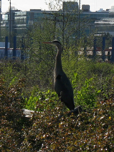
A Heron by Still Creek

This morning, I just happened to see a Great Blue Heron by Still Creek, about fifty feet from Gilmore. There wasn’t anyone nearby, so I approached very slowly and quietly.

Looking Up

This morning, I just happened to see a Great Blue Heron by Still Creek, about fifty feet from Gilmore. There wasn’t anyone nearby, so I approached very slowly and quietly. The heron seemed very nervous, though, probably not helped by some crow that kept buzzing it. But I still managed to get a few good shots before it got fed up and flew away.

More photos

Book Review: The Five Books of Moses Lapinsky

Wow, that took a while. So much for my New Year’s resolution to read a novel a month, eh?

I started on this book in late January, after skipping through three quarters of the Mortal Engines quartet. Then I was taking a class, which left me with very little time and energy for such frivolities. But the class ended, and on Easter weekend I decided to pick it up again. I was immediately hooked, and devoured it in a three-day binge of more-or-less nonstop reading.

I met Karen X. Tulchinsky years ago; she was leading a writing workshop, one night a week for… I don’t remember how many weeks. This was before I started blogging, but I was interested in writing. And meeting guys who were also interested in writing. The workshop didn’t help in that area, but otherwise I thoroughly enjoyed the experience. Ms. Tulchinsky was a great teacher, very friendly and supportive.

Now that I think about it, I’ve gotten the same impression from her previous books—one short story collection and two novels, all dealing with the trials and joys of being a Jewish dyke. I’m rereading some of the stories in In Her Nature, and (to this non-Jewish non-dyke) the history, the culture, the Yiddish, they never seem forced or self-conscious. Just a simple This is who I am. This is who we are. Sure, it’s okay to laugh along.

This latest book is different, though. It’s “queer” only in the loosest sense—only a couple of characters, including the titular narrator, are gay—but it’s still there, part of the tapestry of human experience. Another difference is that it’s not set in the present day (except for the framing narration at the start of each section, most of the action takes place in the 30’s and 40’s), and thus deals much more heavily in presenting Canada as it was then, and Canadian Jews as they were then. We know all the dates and facts about the Depression, about World War II, D-Day, about antisemitism. But the magic lies in making all that history come to life, and Tulchinsky pulls it off, brilliantly mixing the personal dramas with the wide sweep of historical events.

Interesting technique to really grab the reader: Tulchinsky writes in present-tense narration. Nice choice; it felt so natural I took a hundred pages to even notice.

This being a historical novel, the details are made up but the story is true. Toronto youths wearing Swastika badges, fighting Jewish kids; the Christie Pits riot; the disastrous Battle of Dieppe; pogroms in Tsarist Russia. All these things happened. And though Sonny “The Charger” Lapinsky never actually existed, other Jewish boxers lived and fought during the Depression. Though Yacov Lapinsky never existed, the stories he told of his escape from Russia are deeply rooted in reality—a lot more than I realised then, probably. Because, as I said, I’ve been rereading In Her Nature and one of the short stories there (“Canadian Shmadian”) contains some parts of those tales; surely they come courtesy of Tulchinsky’s older relatives.

Most of the novel’s events are related in chronological order, starting on the day after the Christie Pits riot in August 1933. Throughout the book we’re told all the facts, how that day affected the Lapinsky family: Sonny’s anger, Izzy’s brain damage. But in the last chapters take us back to the riot, and even though I knew exactly how things would turn out, I still couldn’t stop reading. Now that’s impressive.

The Five Books of Moses Lapinsky is a masterpiece: engrossing, educational, full of human drama that’s still not without comedy. Tulchinsky has done a wonderful job of honouring her family by creating this ficionalised, though still true, tale.

Geography

A little while back I wrote that, in the blog’s new version, I’d be proudly displaying my daily pictures of Sunset Beach in the sidebar. This is still the plan. And with a much wider layout it’s absolutely feasible. But in the last few days of figuring out widgetizing sidebars (two of them), installing a few more plugins, deciding on all the right navigation aids and so on, I hadn’t really visualised how big a 240 x 180 image was. Stuck on top of the sidebar, I feel it’s becoming a focus point of the whole page.

I didn’t really see this coming, though I probably should have.

A little while back I wrote that, in the blog’s new version, I’d be proudly displaying my daily pictures of Sunset Beach in the sidebar. This is still the plan. And with a much wider layout it’s absolutely feasible. But in the last few days of figuring out widgetizing sidebars (two of them), installing a few more plugins, deciding on all the right navigation aids and so on, I hadn’t really visualised how big a 240 x 180 image was. Stuck on top of the sidebar, I feel it’s becoming a focus point of the whole page.

Which… is not a bad thing, actually. I’ve been thinking for a while that my blog would become less focused on posts, and more on my current projects and photography. But I hadn’t fully grasped how the layout would have to change with the content. And frankly, I still don’t. This is very new to me, and I’m still feeling my way across the weird, wonderful landscape of Web design.

Tagging

I’ve been reading this very excellent blog full of tips and info about Wordpress. Right now I’m pondering tags and categories.

I’ve been reading this excellent blog full of tips and info about WordPress. Right now I’m pondering tags and categories.

Since I switched to WordPress for the current version, I’ve been using categories and not tags. For a while I tried to get a hierarchy of categories, but I just couldn’t decide on the right one. And the end result is a very unbalanced list. “Comics” and “Life” have quite a few posts, while “Music” has two. That never felt right to me. On one hand, it was a constant nudge that maybe I could blog a bit more and flesh out these sparse topics, but I never really got around to it. So the nudge became more “annoyance” than “inspiration.”

The other problem was, a lot of my posts fit into more than one category. What was the point, if a post didn’t fit into a clear hierarchy?

Now I’ve gotten (back) on Flickr, and discovered the joy of tags. And I realize that I don’t actually need categories. If readers want to browse through my blogs, tags will work just as well—along with my Google custom search engine, of course, and all the other Web 2.0 doodads I’ve just started tinkering with.

Of cherry blossoms and insecurities

I’ve just finished the Easter theme for the VGVA site. It’s been a fun and challenging experience, improving my skills and deepening my understanding of many Illustrator features. Pushing the envelope, that’s what it’s all about.

I’ve just finished the Easter theme for the VGVA site. It’s been a fun and challenging experience, improving my skills and deepening my understanding of many Illustrator features. Pushing the envelope, that’s what it’s all about.

Plus, the kudos. Those are always good.

The header graphic was the most complex I’d done so far; in fact, the real challenge (in addition to figuring out the tools at my disposal) was having a clear idea of how the finished product should look. I had to make several changes to the colour scheme along the way and my first draft, was very rough: some rough Paintbrush daubs in place of cherry blossoms, and a few lines sketching out a tree. So the next step, naturally, was to add more details, make everything more realistic.

Or… was it? The problem was that (a) it’d be a lot of work, and (b) even if I pulled it off, it might not necessarily look that good anyways. Maybe realism was overrated; maybe an overabundance of little details would just overwhelm the viewer, and all I had to do was show the essence of cherry trees and Easter eggs and all that springtime goodness. (Granted, the eggs were the easy part.)

For the next few days I kept going back and forth between the two extremes. The fact is, I wasn’t that secure with my visual imagination (something I already blogged about) and so falling back on what my camera saw instead of creating my own interpretation seemed a safe solution.

Well, I think the final product works. I’m still not totally happy with it, but I’ve alway been my own worst critic, so take that with a grain of salt. At the moment I’m heroically resisting the urge to go back and tinker. I can’t find the reference right now, but some years ago I read a quote by Aldous Huxley about regret. He wrote that it was a mistake to continually go back and fiddle with your finished works. No matter how much you polished them they would always have flaws; at some point you just had to let go, learn from your mistakes, and go on to make whole new works. And that’s exactly what I’m going to do: identify what needs work, and then fix it in a later version. I probably can’t do much better right now. A year from now, though? Oh yeah.

Movie Review: Watchmen

Oh, man, that was great.

No, seriously. This is the first time I was very, very pleased with an Alan Moore movie. League of Extraordinary Gentlemen was a massive clusterfuck from the word go, V for Vendetta was pretty good, but not great. This, though? Yes.

Oh, man, that was great.

No, seriously. This is the first time I was very, very pleased with an Alan Moore movie. League of Extraordinary Gentlemen was a massive clusterfuck from the word go, V for Vendetta was pretty good, but not great. This, though? Yes. I was so afraid it would suck—either it would try to stay true to the comic and fail, or it wouldn’t even try, and thus suck as an adaptation. But the movie managed to be both true to the source material and be very watchable. A lot of the backstory and exposition was nicely filled in with various flashbacks and montages, most of which were merged into the storyline pretty smoothly. The only exception I can think of is Ozymandias’ origin. The movie has him expositioning to a bunch of financial bigwigs just before his attempted “assassination,” which felt forced and didn’t reveal all that much anyway. Oh well.

Some stuff was trimmed or tweaked, like Dr. Manhattan’s solitary meditation on Mars, but that’s fine. A couple of scenes were actually improved, like when Nite Owl and Rorschach broke into Veidt’s computer network. In the comic, Nite Owl when entered “RAMESES”, the system helpfully told him the password was incomplete. The movie bypassed this silliness, showing Dreiberg attempting a few passwords before hitting on “RAMESES II”. I also liked the new costumes. It’s a well-known fact that while many superhero costumes look good on paper, they don’t look so good on the big screen (or the little screen). Case in point: the very, very dorky 1940’s Minutemen costumes in the opening montage. Seriously, Mothman, with the wings? Hooded Justice, with that noose around his neck, what’s up with that?

As for Ozymandias’ master plan? Well, I’ve got no complaints. Teleporting a giant psychic squid to kill half of New York might have worked in the comic, but it’d be harder to pull off on the big screen. Ozymandias duplicating Manhattan’s powers? That worked better, and was just as good a testament to his ingenuity.

In short: very impressed, and I’d definitely recommend this movie whether or not you’ve read the original graphic novel.

Back to basics

Redesigning my site is always a special time. It’s a time to start fresh, re-examine all my assumptions and past decisions, ask the hard questions. It starts with the content. What should I keep? What should I add? What should I drop? Before I even get to work on the design, I need to know what I should be designing for.

Redesigning my site is always a special time. It’s a time to start fresh, re-examine all my assumptions and past decisions, ask the hard questions. It starts with the content. What should I keep? What should I add? What should I drop? Before I even get to work on the design, I need to know what I should be designing for.

My Queer History Project? Oh, it stays. Even if I didn’t have any incoming links to it, I’d keep it just because even after 10(!) years I’m still enormously proud of it. It’ll share the stage with the other Web design projects I’ve got going on: VGVA and Team Vancouver

Quotes? For years I used to have lots of quotes, several pages’ worth, including a ginormous one dedicated to the great Terry Pratchett. I decided to drop them in the current version, but I keep going back and forth on it. Thing is, I’m just not sure how to incorporate them in the design. Should I have a random quote in the sidebar? Or a whole, separate page? I still don’t know. Very few of the blogs I’ve seen have have them, so… well, we’ll see. I don’t have to decide today.

Photo thumbnails in the sidebar? Sure thing. I’ll have to find new WordPress plugins to handle Flickr. So far I haven’t seen any that’ll do exactly what I want it to (display a block of square thumbnails just like the Gallery plugin does), but I’m sure it’s out there. Or I’ll do it myself.

In addition to those thumbnails, I plan to show my daily shot of Sunset Beach. Yes, I’ve been keeping that up, though there are a few gaps. Good news for me, Flickr can create slideshows from sets, so I don’t need to futz around in iMovie. Showing off my daily photo will keep me motivated, and provide a bit of regular fresh content.

Twitter and junk? Well, I don’t twitter. Maybe I should? If nothing else, Twitter and Lifestreams and such would be another good way to add content on a regular basis. Why not? My site started out with “essays,” long pieces that took weeks or months to write. Then I moved on to blogging: smaller, more frequent updates. Maybe micro-blogging is the next logical step.

Speaking of which, part of me is still deciding if I want to keep the stuff I wrote “pre-blog,” dating back to 1997. They’re WordPress pages instead of posts, since I don’t have exact publication dates for most of them, and I don’t want to just invent some. Picky, maybe, but that’s just my thing. Part of me is considering dropping the large archive page listing every single post/essay, and doing with category/tag pages (more on tags in a later post). Or maybe monthly archives, but a master list is feeling more and more unwieldy to me. In that case, I’d have to come up with a special page for older writing (like I briefly did, while designing the present version), or drop it entirely.

Decisions, decisions…

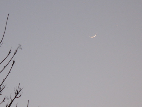
Crescent Moon and Venus

I admit, it was a pure stroke of luck. I was walking home, looking forward to an evening of volleyball, when I happened to look up and saw a lovely new crescent moon. The light was still good so I took its picture, not paying much attention to the nearby bright spot. But it turns out, it’s Venus.

I admit, it was a pure stroke of luck. I was walking home, looking forward to an evening of volleyball, when I happened to look up and saw a lovely new crescent moon. The light was still good so I took its picture, not paying much attention to the nearby bright spot. Turns out, that bright spot is Venus.

Crescent Moon and Venus

Absolutely gorgeous. I had no idea where Venus was supposed to be located that night. And hey: the first photo on this here blog published exclusively on Flickr!